
Introduction
Welcome to the second article of our finance theory series, focused on investment. In the previous article, we delved into the fundamental concepts of return and risk, exploring different ways to measure them. We also looked into how returns are distributed in the financial market. We assumed they follow a normal distribution and are defined in terms of return and volatility, which is linked to risk. In this article, we’ll discuss how we can compare assets based on these metrics, and more importantly, what happens when we start adding them into a portfolio.
Assets and Portfolios
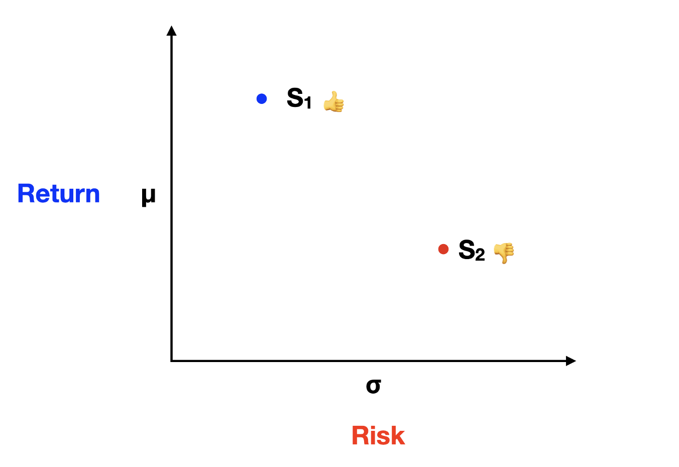
As rational investors, we're on the hunt for assets that offer higher returns with lower volatility. We all love gains, but we're not fans of the roller-coaster ride that comes with high uncertainty. To compare two assets, we use these metrics, plotting them on a graph of return and risk. In the graph below, you'll see S1 representing the first stock and S2 the second stock. Now, which one would a rational investor prefer? It's a no-brainer, S1, because it offers a higher return for lower volatility.
But wait, are all investors truly rational? Nope! Some folks love playing the lottery or taking a gamble. Enter the fascinating world of behavioral finance, which aims to understand this human irrationality and how it influences financial markets. We'll dive deeper into this topic in a future article.
Now, when we compare assets on a two-dimensional graph, with return on the y-axis and risk on the x-axis, it's straightforward. But what happens when we start mixing assets in a portfolio? Imagine we have a low-risk, low-volatility stock A and a high-risk, high-return stock B. What do you think will happen if we blend these two in a portfolio? Let's consider three scenarios:
- All the money in stock A;
- All the money in stock B;
- An equal 50-50 split between stock A and stock B.
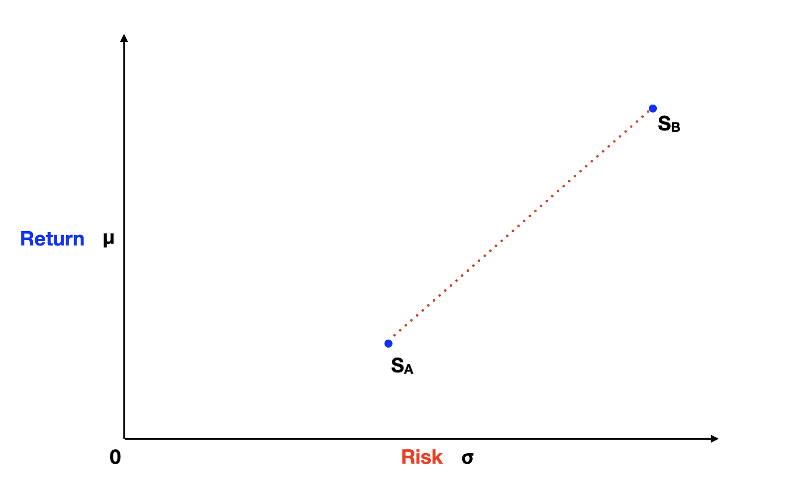
Scenarios 1 and 2 are fairly straightforward, the portfolio would fall exactly at the space where stock A is, for scenario 1, and where stock B is, for scenario 2. But scenario 3 is where it gets interesting. Most people would assume that in scenario 3, the portfolio would fall somewhere in between stocks A and B along the red dotted line of the graph above.
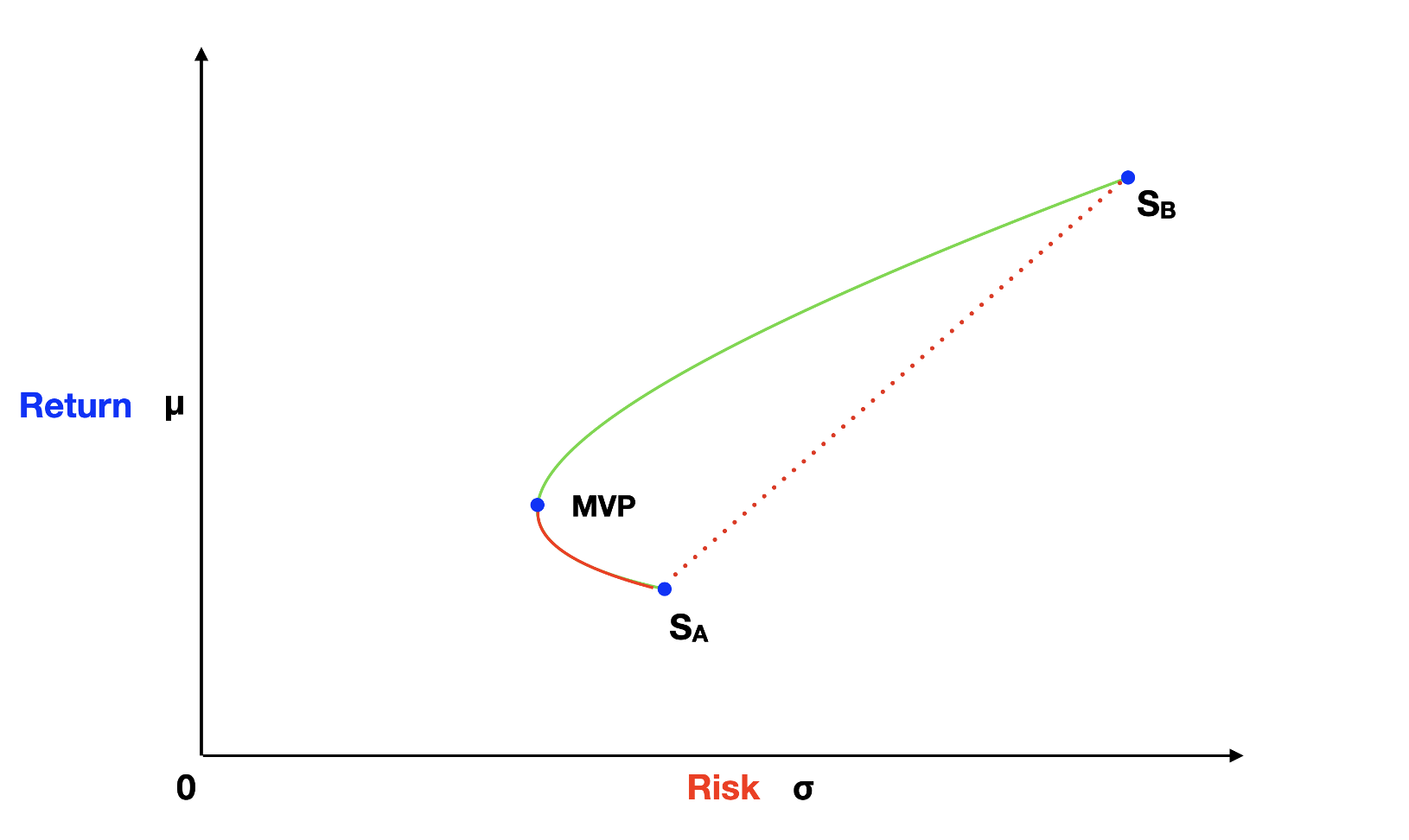
However, this intuition is incorrect, and this is where Modern Portfolio Theory (MPT) offers a brilliant insight. In reality, a portfolio created by mixing stock A and stock B falls on a hyperbola curve, pointing to the left side of our graph. It's a fascinating discovery! By blending these two assets, we can create a portfolio with lower volatility than either of the individual assets. The lowest-volatility portfolio we can create is known as the Minimum Variance Portfolio (MVP).
To grasp this effect, let's explore the following formulas for calculating a two-asset portfolio return and variance.
E(Rp) = ωA * E(RA) + ωB * E(RB) = ωA * E(RA) + (1 - ωA) * E(RB)
σp2 = ωA2 * σA2 + ωB2 * σB2 + 2 * ωA * ωB * σA * σB * ρAB
For the portfolio return formula, we have ωA representing the weight, or percentage allocation, on asset A multiplied by its expected return E(RA). Plus, ωB representing the weight on asset B multiplied by its expected return E(RB). The return of a portfolio is a weighted average of the returns of the assets. A portfolio with a 50-50% split between stock A and stock B falls exactly in the middle of the red dotted line in terms of its return.
The variance formula, on the other hand, introduces an extra component: the correlation (ρAB) between stock A and stock B. Correlation is a number between -1 and 1. If stock A and stock B had a perfect positive correlation of 1, the hyperbola effect would disappear. In that case, any portfolio created by mixing the two stocks would fall on a straight red-dotted line.
However, for correlations below 1, portfolios follow the hyperbola curve, pointing to the left. As correlation decreases, the hyperbola effect increases, approaching the y-axis of the graph and touching it for a correlation of -1. This explains why investors seek to add assets with low correlations to their portfolios. Low correlation assets can contribute to reducing the overall risk of the portfolio, as exemplified by the MVP case.
Now, let's bring a risk-free (Rf) asset into the picture. The risk-free asset sits on the y-axis of the graph, indicating zero standard deviation (volatility). The future value of a risk-free asset is the same in any up or down state of the economy, as you might remember from the first article of this series. Short-term treasury bills, known for their safety, serve as a real-world example of a risk-free asset.
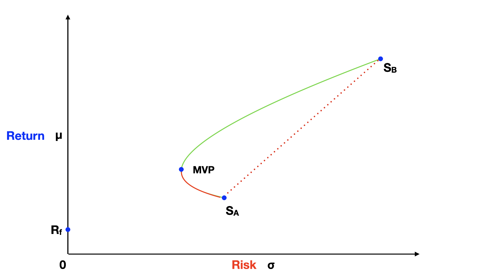
We can create portfolios by combining the risk-free asset with, say, stock A. These portfolios fall on a straight line between the risk-free asset and stock A. The reason lies in our portfolio variance formula. When we mix the risk-free asset with asset A, the last component of the formula becomes zero because the standard deviation for the risk-free asset is zero. Therefore, these portfolios align on a straight line. The same applies when mixing the risk-free asset with stock B.
Additionally, this straight-line pattern holds for portfolios along the hyperbola curve. As we choose portfolios going up on the hyperbola curve to mix with a risk-free asset, the angle of the line between the risk-free asset and these portfolios increases. The highest possible slope for this line occurs when the line and the hyperbola curve are tangent to each other. The point where they touch is known as the Tangency Portfolio.
Since the Tangency portfolio has the highest return to risk ratio, rational investors would choose it as their risky portfolio. And to reduce the risk, if needed, it’s always possible to mix some risk-free asset, therefore, positioning the portfolio along the line between the risk-free asset and the Tangency portfolio.
Now, is it possible to increase the risk, making it higher than the Tangency portfolio and still preserving the return to risk ratio? The answer is yes! This strategy can be achieved by short selling the risk-free asset and investing it on the Tangency portfolio. In reality there is a spread between the borrowing rate and the investing rate so the solid green line on the graph would break at the Tangency portfolio point.
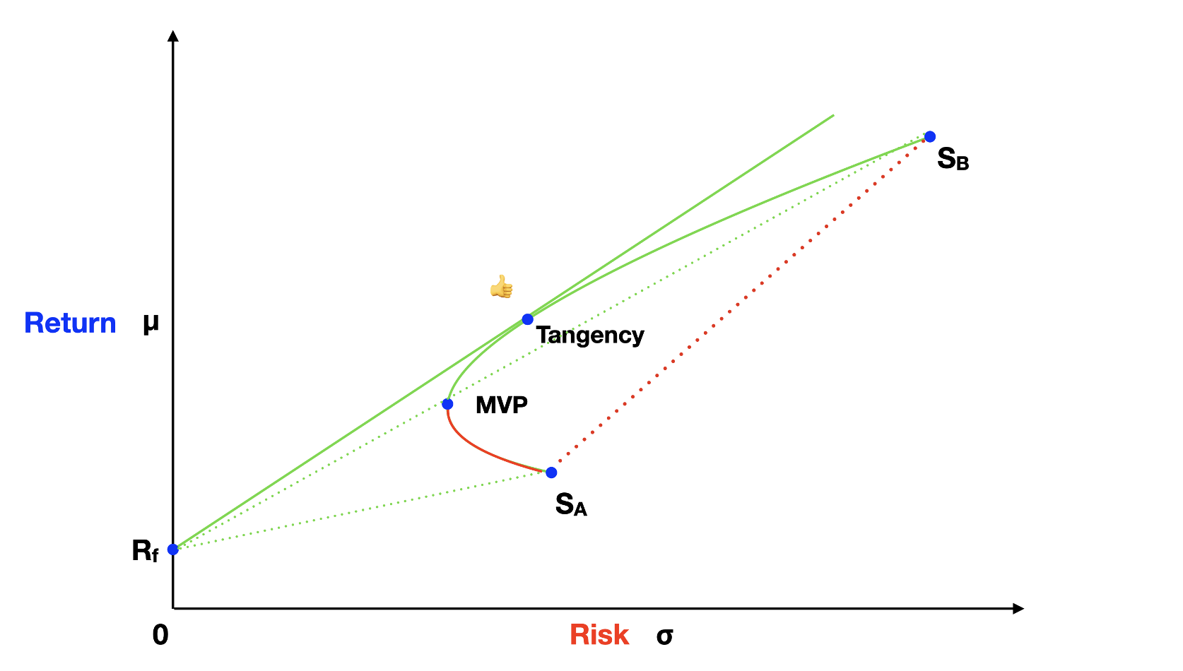
To evaluate portfolio performance, we calculate the Sharpe ratio, representing the slope of the line between the risk-free asset and the risky asset. It's calculated as the portfolio's return minus the risk-free rate divided by its standard deviation.
Sharpe Ratio = (μp - Rf) / σp
Since portfolios along the solid green line of the graph above have a higher Sharpe ratio than any other, they are the most efficient. Therefore, rational investors prefer to invest along this line. For naming conventions, the solid straight green line is known as the Capital Allocation Line (CAL) and the hyperbola curve is called the Efficient Frontier (EF).
We've covered the portfolio building concept using just two risky assets, but introducing three or more would lead to similar conclusions. The difference is that we'd have many hyperbola curves, generating a multitude of portfolio choices. As more low-correlation assets are introduced, the Efficient Frontier gets closer to the y-axis, offering portfolios with higher Sharpe ratios.
What's Next
In the third article of this series, we'll dive deeper into the risk metric and explore the power of diversification. If you have comments or feedback about this article, please send us a note at feedback@bearnbull.com. Make sure to also visit BearNBull's website, where you can find more resources to make you a better investor.