
Introduction
Is it possible to fix the expected return of an investment portfolio and, at the same time, reduce risk? The answer is yes! You can do that just by mixing other risky assets to the portfolio. The concept is not new, Modern Portfolio Theory (MPT) was introduced by economist Harry Markowitz in a 1952 essay. In 1990, he won the Nobel Prize in Economics for his insights. So why are most people still surprised with MPT’s results? The answer is that the results are counter intuitive, so it feels a little bit like magic. My goal with this article is to demystify some of that magic, so self-directed investors can better understand risk and return in their portfolios.
Comparing Assets
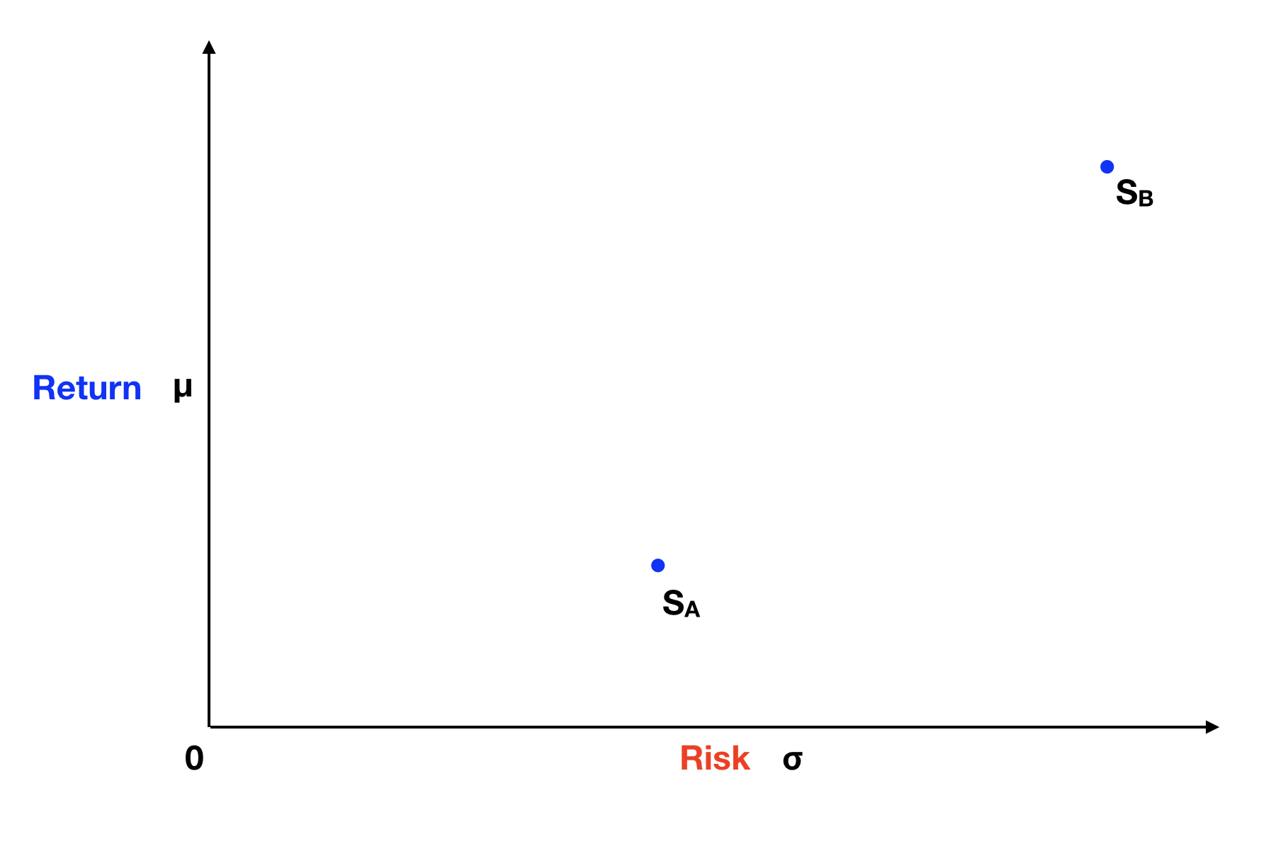
Let’s start by defining two assets, stock A and stock B, in terms of their expected return and risk, where risk is determined by the stock’s volatility in the market. We can then plot and compare these two stocks on the following graph, where the Y axis represents the expected return and the X axis the risk of the stocks.
Basic Intuition
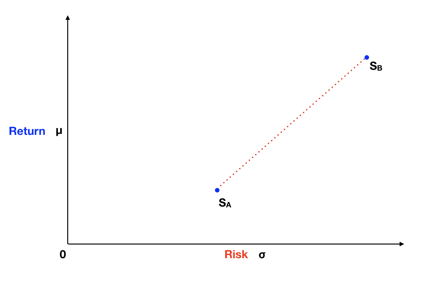
We can easily see that stock B has a higher expected return and higher risk than stock A. But can you predict where in this graph is a portfolio with a 50% weight split between these two stocks? Our natural inclination says that such portfolio is half way on a straight line between stock A and stock B. And that a portfolio with 75% weight on stock A and 25% weight on stock B, is one fourth of the way going up that line. The red dotted line on the graph below represents all the possible portfolios between stock A and stock B, as predicted by our basic intuition.
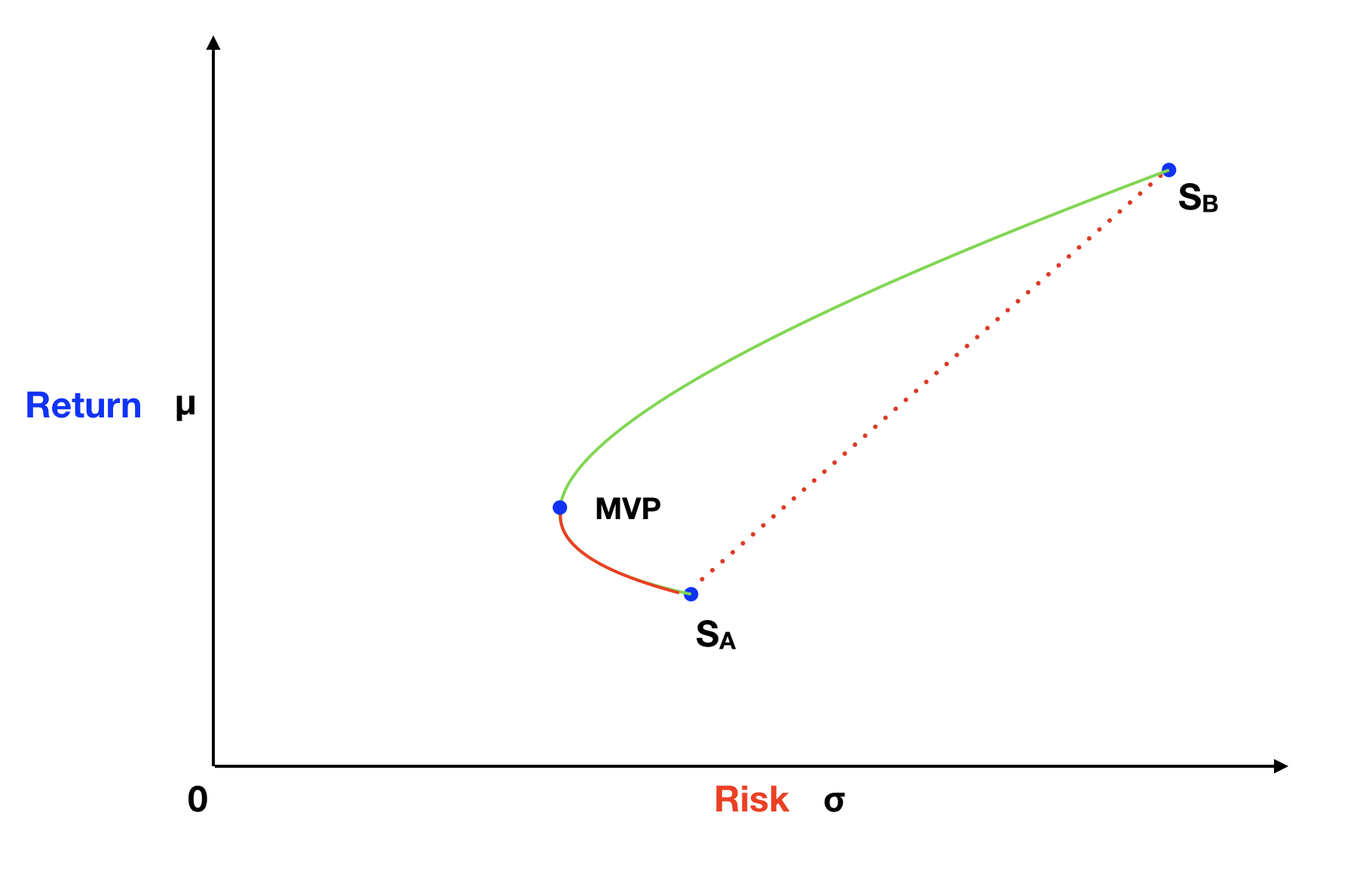
In this case, our intuition is wrong! The line of all possible portfolios of stock A and stock B is not straight, it is curved in the direction of the Y axis, having a hyperbola shape. This is pretty amazing, because it means that we can create portfolios with stock A and stock B, which have less risk than either of these stocks! On the next graph, the blue dot with the label MVP, shows one of these possible portfolios, specifically called the Minimum Variance Portfolio.
Correlation Magic
So where is the magic? How is that possible? To solve this puzzle, we need to understand how the portfolio expected return and risk are calculated. I am going to use the two-asset portfolio formula provide on the Wikipedia page for Modern Portfolio Theory. These formulas are easy to deduct with the use of algebra and basic finance knowledge, but I’ll spare you the math, so we can focus on the results.
The portfolio expected return calculation is quite simple. It’s just a weighted average of the individual stock returns, as illustrated by the following formula:
E(Rp) = ωA * E(RA) + ωB * E(RB) = ωA * E(RA) + (1 - ωA) * E(RB)
Where E(R) is the expected return and ω is the weight allocated to each stock.
This formula is consistent with our initial intuition, that the plot of portfolios created with stock A and stock B would be on a straight line between these two stocks. Now, let’s analyze the formula for portfolio variance, which is the square of standard deviation, our chosen measure of risk.
σp2 = ωA2 * σA2 + ωB2 * σB2 + 2 * ωA * ωB * σA * σB * ρAB
Where σ is the standard deviation of each stock and ρ is the correlation between stocks.
This is where our intuition is failing us. The portfolio variance formula has an additional, and unexpected, component: the correlation between the stocks. Correlation is a number varying between -1 and 1 and describes how the stock returns are related. If the two stocks had a perfect positive correlation, ρ would be equal 1, and the formula would look like this:
σp2 = ωA2 * σA2 + ωB2 * σB2 + 2 * ωA * ωB * σA * σB * ρAB = (ωA * σA + ωB * σB)2
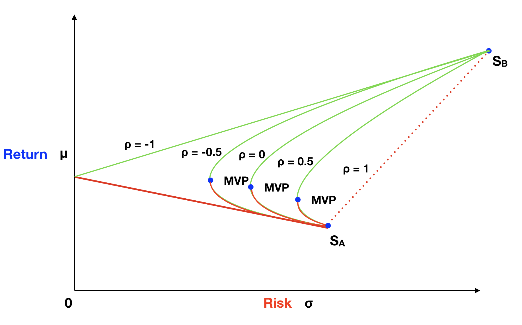
This would be coherent with our initial intuition, that all portfolios formed with stock A and stock B would be on the straight line between A and B. But in the market, stocks rarely have perfect positive correlation. Stock A could go up by 1% and stock B go up by 2% in one month, and then on the following month, stock A goes up by 0.5% and stock B goes down by 0.7%. So ρ will probably be a number lower than 1, therefore, reducing the overall portfolio variance. The graph below shows hypothetical hyperbola curves, each using a different correlation, of portfolios created by combining stock A and B. You can easily see that the lower the correlation of these two stocks, the bigger the reduction in portfolio variance, hence, the lower the portfolio risk.
Risk-free Bonus
Now let’s see what happens when we add a risk-free asset to our portfolio. Treasury bills are probably the closest proxy we have in the market for a risk-free asset. The probability that the US government will default in the short-term is basically zero. In any up or down state of the economy, the future value of the treasury bill is the same; therefore, its standard deviation is zero. We can then use the same two-asset portfolio formulas, to calculated expected return and risk of a portfolio that mixes the risk-free asset (rf) with another risky portfolio of assets (rp). In our case, you can imagine the risky portfolio (rp) as a mix of stock A and stock B. The results would be the following:
E(Rp) = ωrf * E(Rrf) + ωrp * E(Rrp) = ωrf * E(Rrf) + (1 – ωrf) * E(Rrp)
σp2 = ωrf2 * σrf2 + ωrp2 * σrp2 + 2 * ωrf * ωrp * σrf * σrp * ρrfrp
Since the risk-free standard deviation (σ) is zero, we can reduce the portfolio variance formula to:
σp2 = ωrp2 * σrp2
Graphically, all sets of portfolios created between the risk-free asset and another risky portfolio, would fall on a straight line. And we can use any portfolio created by mixing stock A with stock B as our risky portfolio. On the following graph, both the solid and the dotted green lines represent some of the investment opportunities created by this approach.
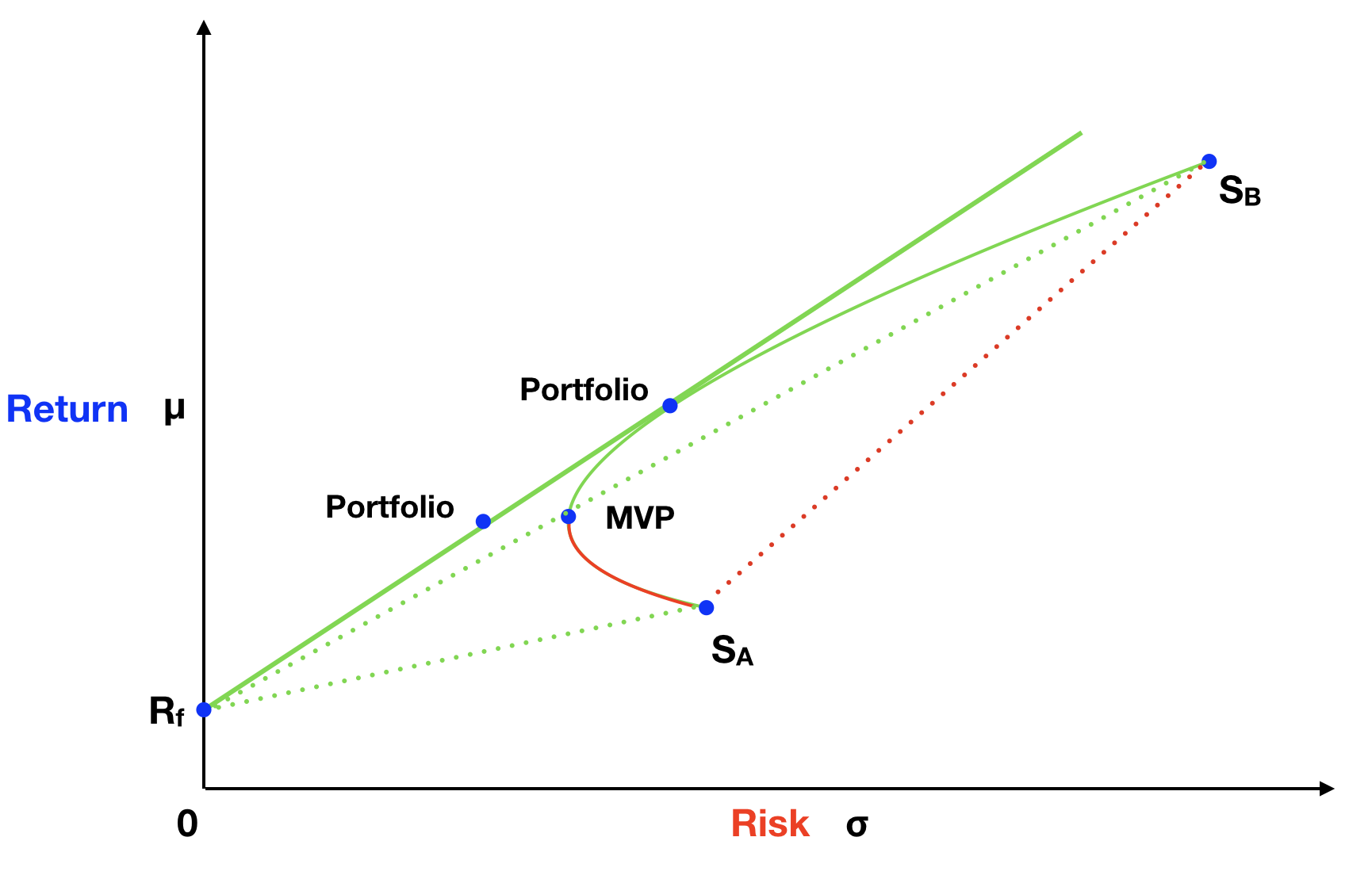
I want to call your attention to the solid straight green line that is tangent to the hyperbola curve. The portfolios on this line have the highest return per unit of risk. One way to illustrate this is by comparing the MVP portfolio to a portfolio with similar expected return on the straight green line. The portfolio on the green line clearly has lower risk. Almost like a second act on a magic trick, we are able to get a bonus reduction of the investment risk, just by adding the risk-free asset to our portfolio!
Portfolio Efficiency
Another way to understand this concept is by recognizing that the solid straight green line has the highest angle, in relation to the X axis, than any other green line. Mathematically, we can calculate how efficient a portfolio is by dividing the portfolio return premium, defined as the expected return above the risk-free return, by the standard deviation of the portfolio. This measure of efficiency is called the Sharpe ratio. Portfolios on the straight green line will always have the highest Sharpe ratio, so they are more efficient, than any other portfolio.
Sharpe Ratio = (μp - Rf) / σp
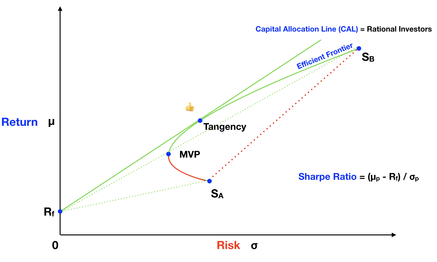
Rational Choices
Rational investors want to maximize return and minimize risk. Any rational investors would choose to invest in portfolios on the solid straight green line, over other possible portfolios on the graph. Investors can calibrate their risk exposure, walking along the solid straight green line, by adding more or less weight to the risk-free asset.
Naming Conventions
In terms of conventions, the solid straight green line is named the Capital Allocation Line (CAL). The hyperbola curve is called the Efficient Frontier. And the risky portfolio, formed by stock A and stock B, at the tangency of the CAL and the Efficient Frontier, is called the Tangency Portfolio. The following graph illustrates these naming conventions:
Reflecting on Diversification
The risk reduction effects that we demonstrated with this two-asset example are amazing. By now you probably realized that diversification is more than just having many eggs in your basket. The weights that you allocate to each asset matter!
The first question you should be asking yourself is: what are the weights you need to allocate to each asset to create the Tangency Portfolio, which is the risky portfolio of choice for all rational investors? The answer is that you can find out what the Tangency Portfolio is. If you know the expected return and standard deviation of each asset, you can calculate the weights of the assets on the Tangency Portfolio. You can also find out the asset allocation of any portfolio on the Efficient Frontier.
Another important question: Is there a limit to this diversification magic? Can you continue to reduce portfolio risk by simply adding more assets? The beneficial diversification effects that we showcased will continue as you add more assets, with lower correlation to the portfolio. The algebra becomes a bit more complex, but the correlation component is still present. The limit to diversification happens when you cannot find other lower correlation assets to add to your portfolio.
The Market Portfolio
There is a theoretical demonstration, which says that the risky portfolio providing the highest Sharpe ratio in the market, should be a market capitalization weighted portfolio of the whole market. This is the reason why advocates of passive investing choose to invest in an index fund of the market. But be aware, there are many indexes out there and not all of them are market capitalization weighted indexes. Another important reality check is: the whole market is unobservable, so there is no perfect proxy for it! It should include all the assets in the world economy, such as public stocks, real estate, bonds, private equity, etc. Most people will use the total US equity market or total international equity market as their proxy, but it still not the whole market.
Conclusion
This article only scratched the surface of portfolio allocation. But we hope we were able to demystify some of the magic that happens when you mix different assets in your portfolio. And also, how diversification is much more than just mixing different assets in your portfolio. Finance theory is permanently evolving and there are many unanswered questions. If you are interested in diving a bit deeper on the subject, we recently posted a video series about these and other important insights. Here is the link: BearNBull Finance Theory.
We created BearNBull to help investors understand portfolio risk and return. The application makes it easy to create portfolios, calculate risk and return, discover the tangency portfolio and forecast risk. The simulations are coupled with social features, to stimulate collaborative learning. Some of the social capabilities available are: sharing portfolios, following strategies shared by other investors, cloning and remixing portfolios, among others. We encourage you to give BearNBull a try! Most of the features are free to use and you only need a valid email to signup. And feel free to send any comments or feedback to feedback@bearnbull.com.