Introduction
This is the third and final part of our portfolio performance series. The first two articles, Into The Rabbit Hole and The Perils Of The Path, gave us a clear understanding of what portfolio performance entails, key metrics to track and how to calculate them. But let’s face it, what a heavy load to carry! Understanding the concepts and knowing formulas is one thing, having to do all the work is another. In addition, other metrics and smart visualization techniques can add power to your portfolio analyzes. Wouldn’t it be nice to get some help along the way?
BearNBull is the sherpa you are looking for on this journey! We’ve spent a lot of time making advanced portfolio analyzes simple and insightful. On this final part, we’ll showcase some of the work we are doing at BearNBull, giving some concrete examples of how you can improve your own analyzes.
Portfolio Performance With BearNBull
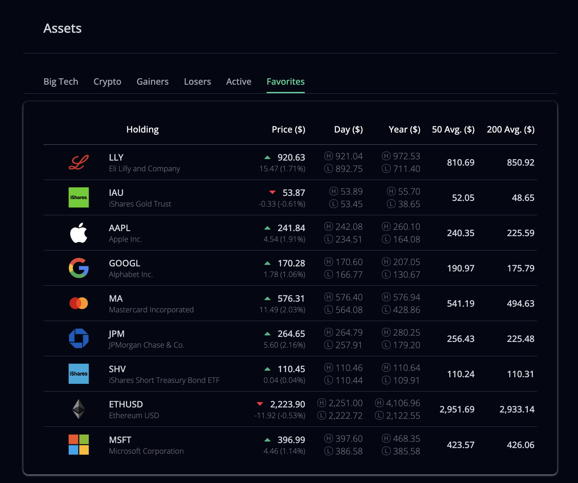
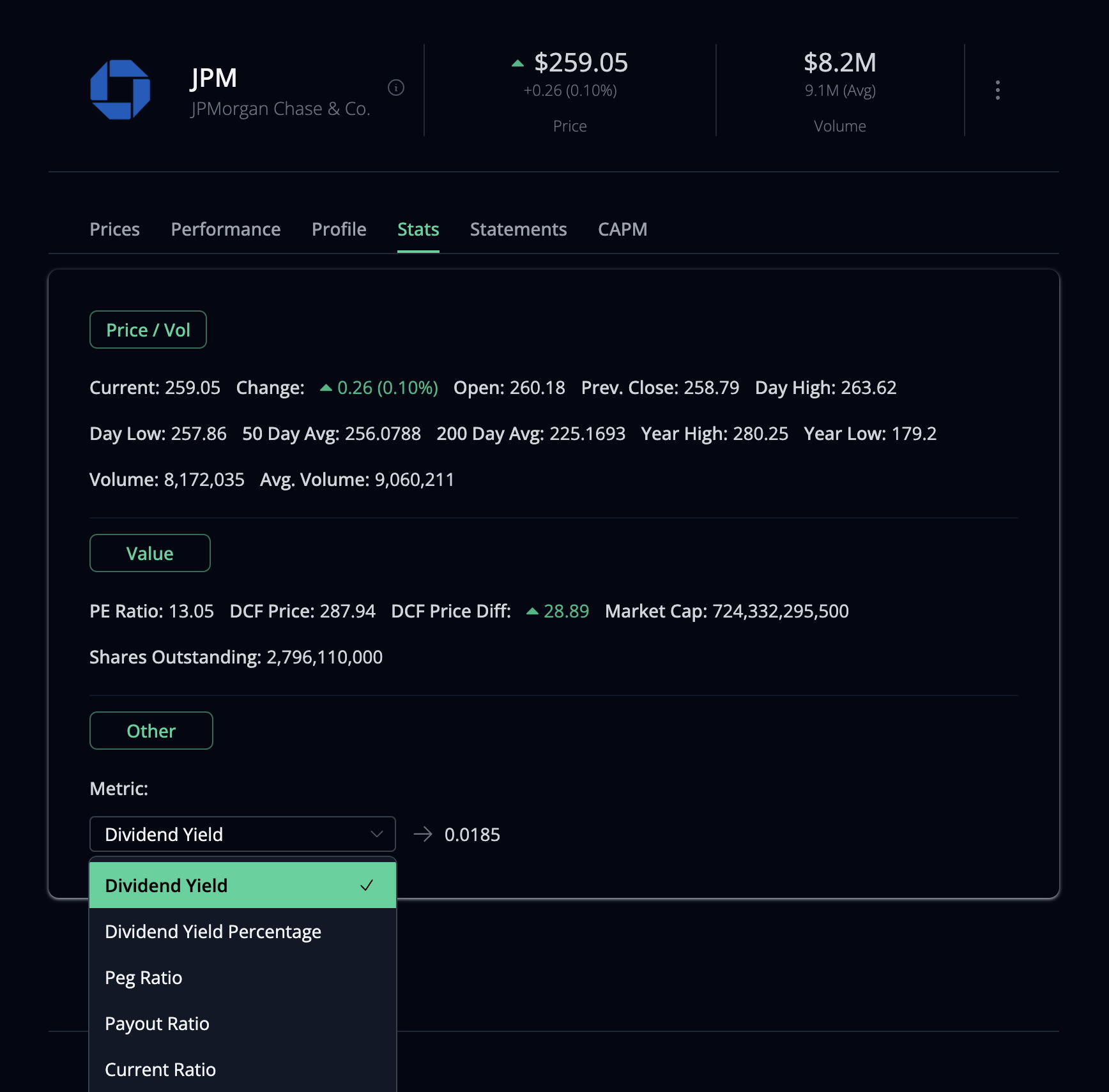
Creating a portfolio on BearNBull is easy and it’s the best way to learn all the bells and whittles of the application. You can add assets and transactions from your actual portfolio, which will give you amazing performance tracking capabilities. Or you can add a simulated portfolio, using it to backtest and to evaluate portfolio opportunities. Either way works, I personally use both!
Here some of the metrics and visualization BearNBull can provide for your portfolio analyzes:
Value
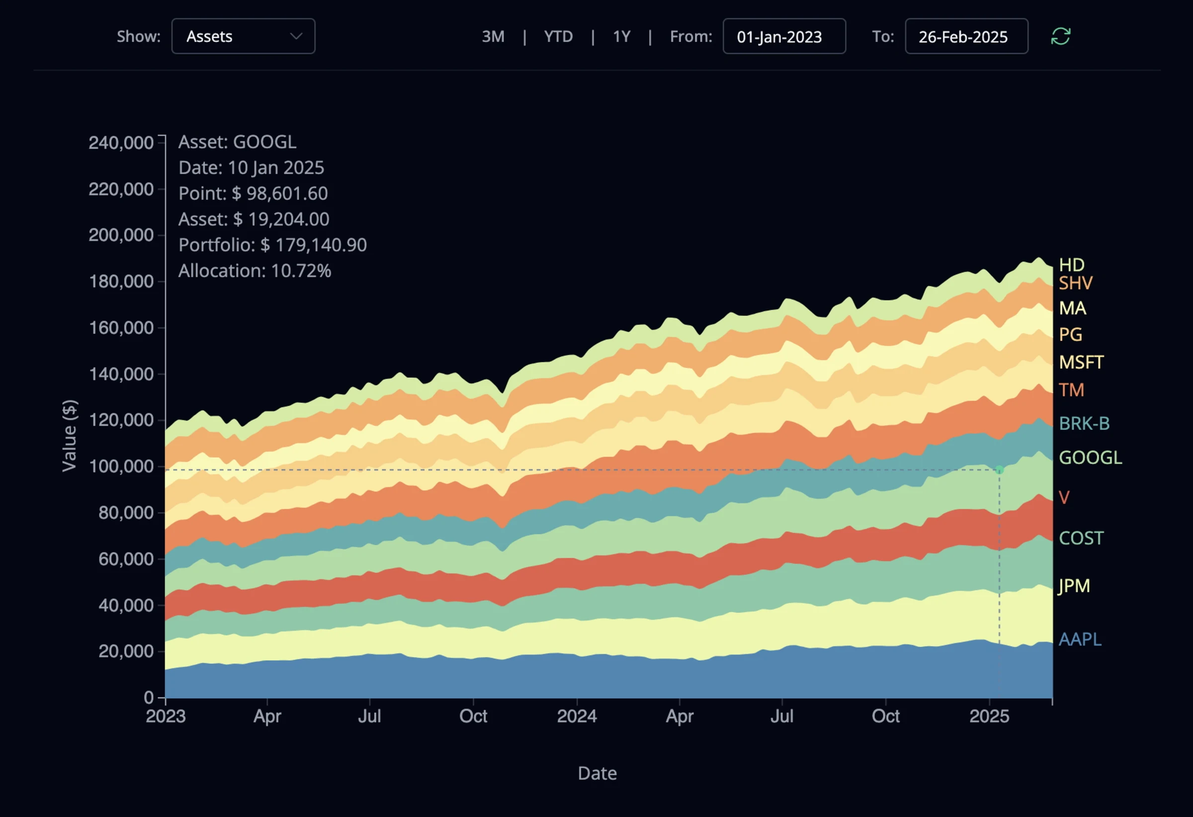
Keep track of historical asset and portfolio value. You can chart all assets or just the ones you need for your analyzes. You can also see how allocation for each asset changed during the period.
Allocation
Compare current and target allocations, by asset, category, sector or industry. Both bar and pie charts are available.
Gain/Loss
Track historical gain and loss of the portfolio and its assets. Pinpoint which assets are contributing most to your portfolio performance, both currently and is the past.
Cash Flow
Measure the historical total value of your portfolio or asset against the cumulative cash flow during any time period. This is an extremely helpful graph to analyze gain or loss of the portfolio and its assets during the period. The graph shows when you gained or lost value and each asset's contribution.
Performance
The historical returns for your portfolio and all its assets during any time period. The portfolio line represents its Time Weighted Rate of Return (TWRR), which is great for comparing performance with other assets or portfolios. The Money Weighted Rate of Return (MWRR) is also displayed as a message under the graph, together with a comparison of MWRR and TWRR, so you can assess the impact of trades in your portfolio during the period.
Prices
Easily track and compare historical prices for all the assets in your portfolio. As with the other graphs, you can easily toggle the graphical display of any asset in the portfolio.
Risk/Return
This graph compares expected return and total risk of all assets and the portfolio. The efficient portfolios green line is generated according to your specifications. And by clicking anywhere on the green line, you can set your new target and all asset weights are calculated accordingly.
CAPM
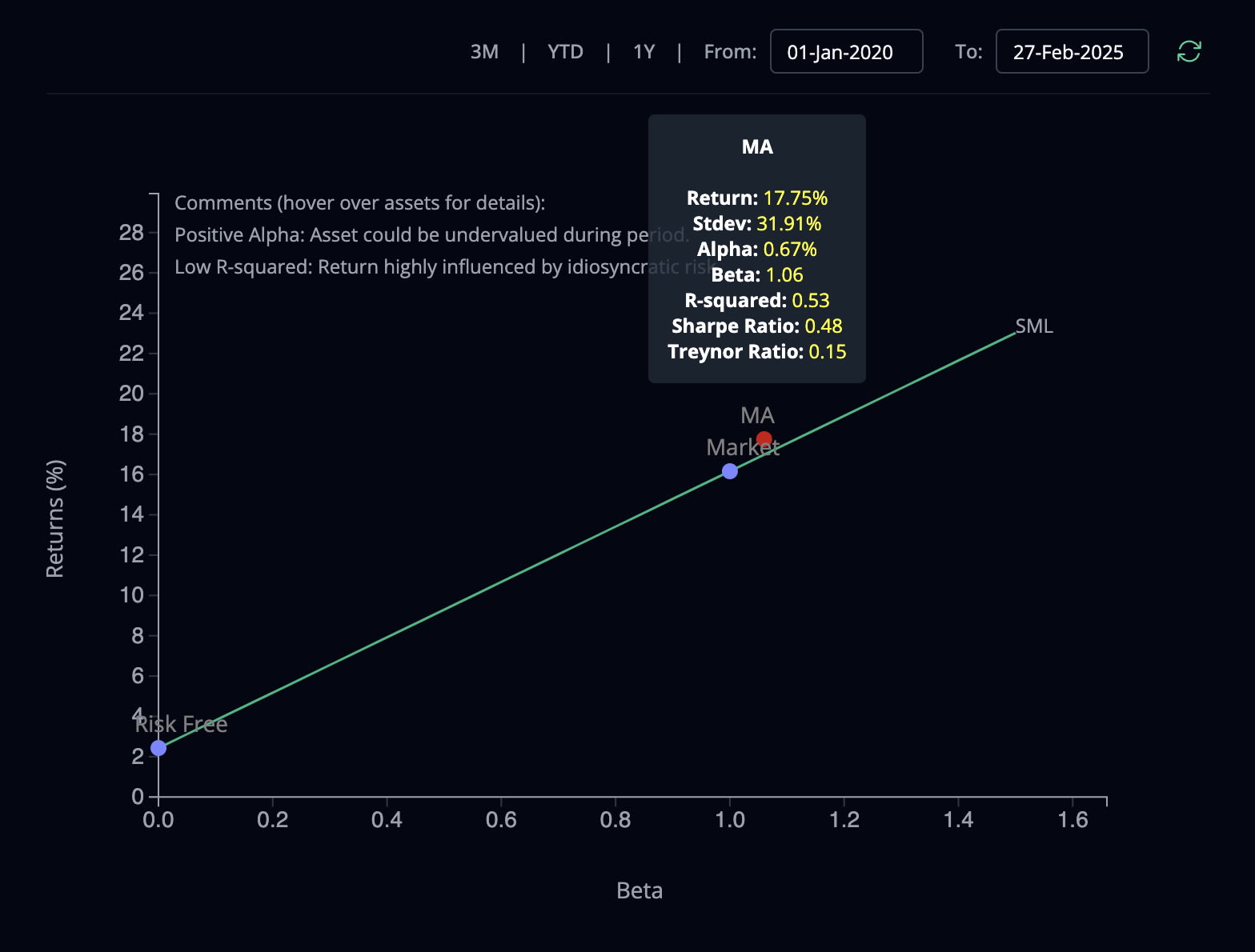
The CAPM graph helps you visualize the expected return and market risk of all assets and the portfolio. The overall diversification of your portfolio can be evaluated by the R-Squared value, the closer to 1.0, the more diversified the portfolio is in relation to the overall market. This value is very useful to assess diversification and it's also displayed on the top right corner of your portfolio page, as a percentage value.
Correlation
A correlation graph of the assets. The information is helpful to identify asset contribution to portfolio diversification. Lower correlation adds diversification to the portfolio.
Forecast
A Monte Carlo analyzes, projecting probability scenarios for the value of your portfolio over a time period specified. The result is based on the target portfolio allocation and gives a range of probability curves, which can help you assess future portfolio value scenarios.
Conclusion
Portfolio performance is a lot to unpack! On this three-part portfolio performance series, we focused on understanding concepts and metrics, that can help us gain better insights of our investments. Our goal was to be practical and not get caught in details about the financial theory, which we only introduced superficially. For those who want to dive deeper, make sure to check out our BearNBull Finance Theory video series. And the Demystifying The Magic of Modern Portfolio Theory article.
You might decide to jump into the portfolio performance rabbit hole on your own or to have BearNBull be your helper. Either way, I hope you now have a better understanding of portfolio performance and can use some of the insights to improve your own analyzes. If you choose BearNBull to help you along the way, make sure to send us your comments and suggestions to feedback@bearnbull.com. We are constantly improving our product and your feedback is much appreciated!